
AppLovin Brand
Logo
These are the primary logos used to represent AppLovin. The full logo should be used whenever possible. The standalone mark is reserved for situations where the AppLovin brand is already well-established, space is limited, or the full logo has already been prominently featured. By downloading or using any assets from this page, you agree to follow our Brand Guidelines. Please review the guidelines before use to ensure consistent and accurate representation of our brand.
Logo - light background
Mark - light background
Logo - dark background
Mark - dark background
Against gradient
Against photo
Clearspace
Wherever our logos appear, sufficient clear space should be maintained to ensure visibility and readability. For both the primary logo and the mark, the exclusion zone should be measured using the width of the mark. The full width clearspace is preferred, use half width clearspace when space is limited.
Logo - full width
Mark - full width
Logo - half width
Mark - half width
Partnership
When representing a partnership with another company or entity, we use the line symbol to indicate the relationship in a logo lockup for both horizontal and vertical.
Horizontal
Vertical
What not to do
The logo should never be modified in any way. Below are some common misuses to avoid.
Don't change the color of the logo.
Don't place the logo on low-contrast background.
Don't use the wordmark by itself.
Don't rotate the logo.
Don't distort the logo.
Don't outline the logo.
Typography
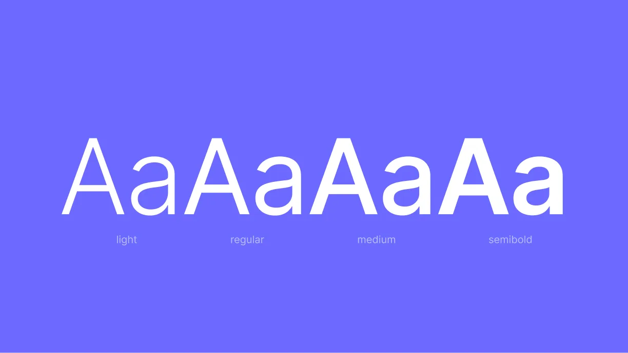
Mont is our primary typeface for headlines and display content, chosen for its bold geometric structure and modern character. Inter is used for body copy and supporting text, offering exceptional clarity and readability. Together, they create a friendly, refined, and accessible brand voice.

Mont
Inter
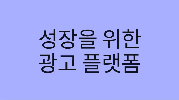
Noto Sans CJK KR
Noto Sans CJK JP

Noto Sans CJK SC
Noto Sans