

As a designer at AppLovin, I often find myself researching various apps to better understand brand identity and discover what features are promoted to potential users. One of the first things that I come into contact with is an app’s icon, which can instantly speak to the caliber of a company’s and/or brand’s product. At its core, a successful app icon should be memorable and unique while still communicating the purpose of an application.
While it can be a daunting task to figure out how best to represent your brand in a single image, here are a few design tips that can steer you in the right direction.
Feel free to follow trends, but still be original.
Always stay on top of trends in the app stores, and feel free to riff on them if you like. A great example of riffing on an icon design concept lies in what I refer to as the “guy yelling motif.” Indeed, if you’ve spent any time browsing the app stores you’ve probably asked yourself, “Why do so many strategy games feature a close up of some guy yelling?” While these icons may not necessarily be ‘original’ given how many iterations of it there are, there’s a reason why they’re so ubiquitous and so successful: they play to humans’ amazing ability to detect the emotions of others. The ability to process and respond to a person’s face is hard-wired into us, so making an app icon that conveys an emotion not only instigates curiosity, it helps the audience to identify with the feelings of the character and thus with the brand. As for the anger in the icon, there’s probably a reason for that, too: angry faces just might be detected more efficiently, which could make a huge difference in a crowded app store.
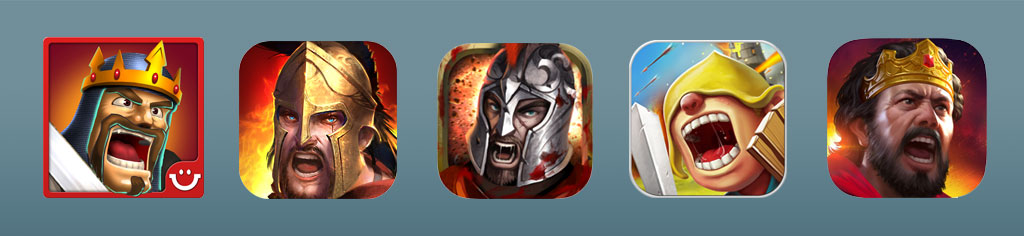
The ubiquitous yelling guy – there’s a reason why he’s everywhere.
While following a successful design trend is perfectly OK, be sure to find ways to make it your own. Familiarize yourself with the advertising trends that appeal to your demographic in a variety of mediums to see what works and what doesn’t. With 2.2 million apps in the Apple App Store alone, you will be competing heavily to make your product stand out from the pack.
Choose your colors carefully.
The use of color in your app icon will without a doubt speak to the subject matter of your product. Bright colors such as red or orange command attention and promote an energetic feeling, while colors such as green and blue can convey a sense of serenity or revitalization. By doing your research on color theory, you can learn how to evoke specific feelings in your audience while capturing the overall mood of your application.
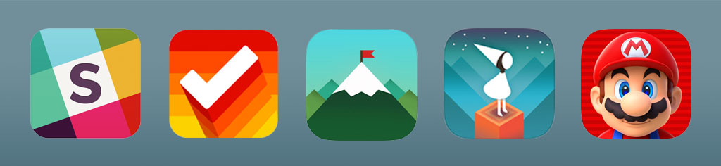
Check out the great use of color in these icons, from left to right: Slack, Clear, Doo, Monument Valley, and Super Mario Run.
Moreover, consider using contrasting colors. Some of the best app store icons use contrasting colors masterfully: the right colors can unify an icon and focus the viewer’s eye, and they add definition to the shapes that inevitably end up tiny in the app store context.
More great use of color, from left to right: Launch Center Pro, Storm, Instagram, Spotify, Memoir.
Be sure to utilize color tonality to your advantage by strategically placing the most contrast where you want to draw your viewer’s eye. A quick way to check if your image has strong contrast is to desaturate it. If you can no longer pick out the contour of the shapes once it is desaturated, you will need to rethink your approach.
Plan for the devices’ home screens.
While it’s easy to get lost in the intricacies of a large design file, it is important to keep in mind that your design will be scaled down a great deal. Stick to a simple layout and avoid adding multiple objects or any text that could clutter your design and make it hard to read. Finally, remember to place your app icon on a variety of background colors to check its readability. Your users will have different backgrounds on their devices and your app icon will need to stand out on all of them.
If you have multiple games, make sure the icons reflect one brand.
Many indie devs get tripped up on this one — they have multiple games in the app stores, but there’s no visual cohesiveness among the icons. But there is good reason for making sure that they are in fact cohesive, meaning recognizable as the products of a single brand: if a user loves one of your games and they can recognize another game of yours by design alone, they’ll be more inclined to download it (plus, it just looks nice). So take the time to integrate the same or at least similar color scheme, illustration type, and fonts into each of your game icons.
Adobe’s mobile app icons show cohesiveness, from left to right: Spark Video, Comp CC, Spark Page, Connect, and Spark Post.
Designing a great app icon doesn’t necessarily take days of work; it just takes following certain design rules and being very aware of what already works (and doesn’t!) in the app stores. If you can be original while playing on successful trends, be mindful when selecting your colors, design with a brand in mind, and design not just with home screens in mind, you’ll be well on your way to an eye-catching icon.